Line
When used well, this shape type can add a pleasing visual experience to your Android application. It is most often used a visual separator between different sections or parts of the app and can make it easier to use.
One important thing to note is that this line ALWAYS takes up the entire width of the containing view. This may seem like quite a hindrance at first but I've found that in most cases you can get the look and feel you want... We'll see this in the examples below.
First, let's look at the simplest example of a line, a simple solid-black line...
res/drawable/shape_black_line.xml
<?xml version="1.0" encoding="utf-8"?>
<shape
    xmlns:android="http://schemas.android.com/apk/res/android"
    android:shape="line">

    <stroke
        android:width="2dp"
        android:color="#000000" />

    <size android:height="20dp" />

</shape>
Some important things to keep in mind when creating a line:
- The width attribute on the stroke element defines the height of the line
- The height attribute on the size element defines the height of the entire drawable
- When the line is drawn it is centered vertically in the drawable
- If the height is the same or smaller than the stroke width then the line won't show up.
- You can omit the height attribute, but if you do you need to take care to make sure that every view that uses this line specifies a height larger than the stroke width
It is also possible to create a dashed line. To do so, we specify the dashWidth and dashGap attributes on the stroke element.
res/drawable/shape_dotted_green_line.xml
<?xml version="1.0" encoding="utf-8"?>
<shape
    xmlns:android="http://schemas.android.com/apk/res/android"
    android:shape="line">

    <stroke
        android:width="2dp"
        android:color="#008000"
        android:dashWidth="3dp"
        android:dashGap="4dp"/>

    <size android:height="20dp" />

</shape>
Controlling Line Length
Depending on what you are trying to accomplish, there are a number of ways to control the actual width of the line. We will look at three different methods for doing this. The method you choose will depend greatly on the app you are developing.
1) Specify Length in the Drawable
With this method, your line will always have an exact width. To do this, you need to add the android:width attribute to the size element in your XML file. This isn't the only thing that needs to be done, however. If you use an ImageView to display your line, you need to be sure to specify the drawable using the android:src attribute... If you use ImageView's android:background attribute you will end up with a line that fills the entire width of your screen.
The following screenshots show an example of a line with a length 150dp:

Rather than having a fixed length, this method allows you to have a fixed margin on each side of the drawable. To specify the length of the line this way you add the android:layout_marginLeft and android:layout_marginRight attributes on the view that will contain your drawable. One advantage to using this method is that you can specify the drawable with either the android:src or android:background attributes (if you are using an ImageView... other views may be slightly different).
The screenshots below show an example of an ImageView with left and right margin values of 50dp:
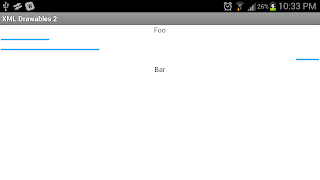
Like the first method, this will result in a line that is the same width regardless of the orientation of the screen. But like the second method you change an attribute on the view that contains the drawable. Since the width is defined in the view, you can reuse the drawable in different views and create lines of different lengths. To do this, you specify the width of the view with the android:width attribute.
The screenshots below show ImageViews with lengths of 100dp, 200dp, and 50dp. The last line is right-aligned:
I'm going to be really honest about this shape... I can't think of many uses for it. The main one that comes to mind would be to define an indeterminate progress wheel. Other than that its usefulness is pretty limited. The easiest way to define a ring is to define its inner radius (the radius of the hole) and its thickness. You can also define a stroke, a solid background color, or a gradient background as demonstrated in the first part of this blog. Here is a basic definition for a ring:
res/drawable/shape_ring.xml
<?xml version="1.0" encoding="utf-8"?>
<shape
    xmlns:android="http://schemas.android.com/apk/res/android"
    android:shape="ring"
    android:innerRadius="15dp"
    android:thickness="10dp"
    android:useLevel="false">

    <solid android:color="#ababf2" />

    <size
        android:height="50dp"
        android:width="50dp" />
</shape>
A couple additional things to note about ring drawables. You need to make sure that you set the useLevel attribute to false. I don't understand why this is the case, but the docs state that if this is not set to false the shape may not display... in all of my tests the ring did not get displayed unless this attribute was set to false.
Also note that there are two additional attributes that you can use to specify the inner radius and thickness. These are android:innerRadiusRatio and android:thicknessRatio. These attributes allow you to specify the settings based on the width of the drawable. For example, if you used android:innerRadiusRatio="3" and the width of the ring was specified as 60dp then the inner radius would be 20dp.
The screenshots below show different examples of using a ring. The first one is the ring specified above. The others show what a ring would look like with a stroke and a gradient. The source files can be downloaded as part of the sample project at the end of this blog:
Hopefully you now have a solid understanding of how to properly specify lines and rings in XML. You can download all the source files from this post below. As always, comments, questions, or suggestions are always welcome.
Download Sample Project


Thanks a lot!!! I was looking for some help with Drawables and this is perfect!
ReplyDeleteThanks.This is I was looking for....
ReplyDelete